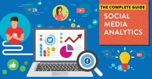
Marketing in this sense is a combination of both art and science, where you churn out content that is created every day, and the science aspect involves figures and facts, real numbers that show growth.
Modern marketing combines the two, and essentially, you need to back everything with data, and you can choose different data points, including app performance, web analytics, the figures that sales have, and even campaign stats.
Data visualization is changing this, and there is a reason why so many people use this type of visualization in modern marketing.
What is It?
Data visualization is used to showcase data, whether it be patterns, market trends, or even outliers and correlations, and it allows those decision makers to understand where they can put their decisions in the business.
If you’re not sure what solution you want to invest in, you should pull out the previous data, look to compare the different performances, and then from there make the right decision.
You can use different ways to make the data explain stories in terms of bar and line charts, or different infographics, word clouds, timelines, and also heat maps.
Essentially, you’re just trying to showcase the data, and that’s a huge part of working with this.
Why Use it in Marketing
This is essentially the means to tell others what is going well, and what isn’t. If you’re unsure of whether a campaign is viable, you should look at the data visualization, and then go from there.
It does change the way the game is, because many times, data visualization plays a focal point in marketing in so many different aspects. It does have a lot of complex uses, but it mostly is used to showcase trends and patterns in order to ensure the project is a success.
Used for Patterns and Trends
One aspect of SEO marketing that many don’t even think about, is the patterns and trends. You want to analyze these in order to see whether or not what you’re doing is well, viable.
There are many times where you may see that something is going well, but the second you look at conversions, sales, or even how long someone is on your site, you may see a lot of disjointed numbers, signifying that it definitely has something deeper related to it.
For example, let’s say that sales and conversions are down, but the amount of people visiting the site is quite high. Why would that be?
Well, lots of times, there are instances where conversions don’t go to sales, and it might be because there isn’t a good enough hook and leads capturing system to get people to stay, or maybe you’re not collecting emails.
Or maybe, you’re just not really selling them the product. Whatever it might be, you should definitely look for these. Raw data does give you numbers, but let’s be real, numbers don’t mean jack until you plot this on a map, compare it to others, spot the patterns and correlations, and look at the trends that develop from the data as well.
Allows you to Distill the Data
Data is complex, and humans by nature love visuals. We are visual creatures at the forefront, and our brain processes images about 60,000 times quicker than text, so our brain will be able to look at images, and understand them much quicker than poring over text.
About 93% of human communication is done through a visual sense. When you go through a spreadsheet that’s literally all numbers, you’re going to feel fatigued.
Have you ever tried to look at some roadmap and visuals sheet, only to feel completely confused due to how many numbers there are? That’s the problem with numbers. they’re complex, and they can make it super mentally taxing.
Stakeholders don’t want to look at hundreds of numbers. You don’t want to have to pore through hundreds of numbers, especially when, the data is quite boring as well.
You want to create a precise system that allows you to look at insights that are actionable, rather than just a slew of data without the actionable steps. Converting these numbers into visuals allows you to simply the rows and columns into the complex chunks that are there.
Can Emphasize Points
If you’re trying to get some points driven forward, or let the company go forward and do certain marketing tactics, sometimes using the right data points will help you. You’ll be able to work with this, fighting tooth and nail to justify the points that you want to make. You can better justify this with building data visualizations.
For example, let’s say that you want to put together a plan that’s a bit different, with a few changes that are a little different from what you’re normally used to doing.
It can be hard to get the agreement of your team, or even the agreement of investors if you’re trying really hard and you can’t seem to get the point driven home.
You can put together some key visuals, and it will allow you to convey arguments through data visualization that supports what you’re trying to put forward.
Visuals allow you to make comprehension and info retention easier for you. Data visualizations allow you to portray the data in a manner that’s purposeful, allowing you to influence the decision makers better.
If you really want your point to be pushed forward, you can use visualizations that really showcase the different aspects of this, and it’s actually a super important point and benefit that data visualization gives to you.
Steers your Strategy
Data is super important with marketing. You want to make sure that you’re giving a clear picture. If you have media that you currently have, you need to see how they’re doing, and if you feel like the numbers aren’t fitting the goals that you have, you have to figure out how you do so.
But, can you really steer the marketing strategy without data? You can’t. you’re just wandering through a forest lost and unsure, and that costs money.
If you want to improve your marketing, especially digital marketing and SEO marketing, you want to make sure visualization is there.
Because if not, you won’t know where to concentrate your efforts, and one of the biggest mistakes of marketing is putting all of your efforts into different baskets that ultimately don’t do a whole lot of good for you.
You need to have a clear focus, and the best way to do it is to utilize data visualization to do so.
Using as Content
You can use data visualization to determine your content. Visualization showcases real numbers. let’s say you put out a ton of content on a subject, but it’s not getting you the benefits that you desire, nor the conversions you seek.
You can look at where you’re performing well, and decide what factors to look at, and from there, you’ll be able to decide for yourself just where to go with this.
Let us take for example you have a website, and you have used different keywords to put together content. You want to look at the traffic that comes from each aspect of the content, and from there, create a chart that points out what is going on. you’ll be able to tell a story of what’s going on based on infographics that allow you to express every single insight in a comprehensive, useful, and sharable and simple format, so you can make the right decisions regarding the content you pump out.
How to Get Started with This
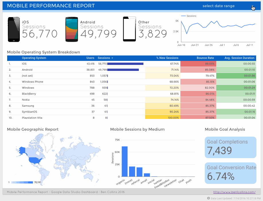
The best way to begin with this is to use different analytics tools, including Google Ads, Google Analytics, social media insights, and keyword insights for whatever media you’re using, and from there, plot this out. Actually, create a visual for this, and see how those numbers impact the goals.
You can use Google Data Studio that supports automatically over 50 sources for data.
You should from here, look at the goals that you currently have, such as maybe you want to increase conversions by 10% in this next quarter. let’s say that you are running an email campaign and want to create more conversions.
You can take every single type of content regarding your emails, place that all on a chart, and from there, you’ll be able to visualize just what you need to do with this, and what performs well, and not so well. This is actually a very viable thing for you to do since it can make a world of a difference in the future endeavors that you have going on.
Data seems really boring to a lot of people, but that’s really not the case. Data visualization is actually super important especially if you want to communicate to others complex data in a simplistic manner.
If you really want to communicate each of these, in order to create a better audience focus, you’ll be able to do so with this data, and in turn, you’ll be able to create a better, more worthwhile campaign.

![Read more about the article How to do Digital Marketing For International Audiences [Guide]](https://competico.com/wp-content/uploads/2022/06/How-to-do-Digital-Marketing-For-International-Audiences-Complete-Actionable-Guide-300x167.png)